Adding Customisation to a Product
On this page:
Overview
If you sell products which are custom made, KhooSeller is the perfect solution allowing you to add customisation options for your customers. These can have price variations attached to them and can even only show once another choice is already chosen making it easier to lead a customer through the customisation process.
If the customisation only applies to one product, then it can be made by editing the product. Make sure the product is selected in the left hand product tree and click edit > customise.
If the customisation will be used across several products then it needs to be made as a preset and then attached to the product. It is possible to attach up to four customisation presets to a single product or to do a mix and match approach of presets and adding customisation options product by product.
Introducing the Customisation Toolkit
This is what is used both for setting up a product customisation preset and for adding customisation options on each individual product.
Go to Design > Presets > Product Customisation and click +Add.
Name your preset. For instance, if you are making a preset which will apply to one type of product, say Photo Albums, it makes sense to call it 'Photo Albums'. If it's a preset which are the colour swatches which are used globally across more than one type of product, you could call it 'Colour Swatch Options' or similar.
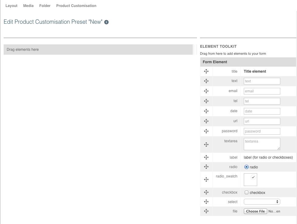
Click "Ok" and then this is the screen you should now see with the element toolkit on the right and the area to drag your elements to on the left.
Title Element
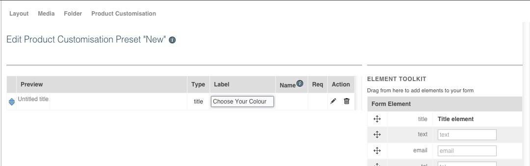
Some customisation elements may require a title such as radio swatches.
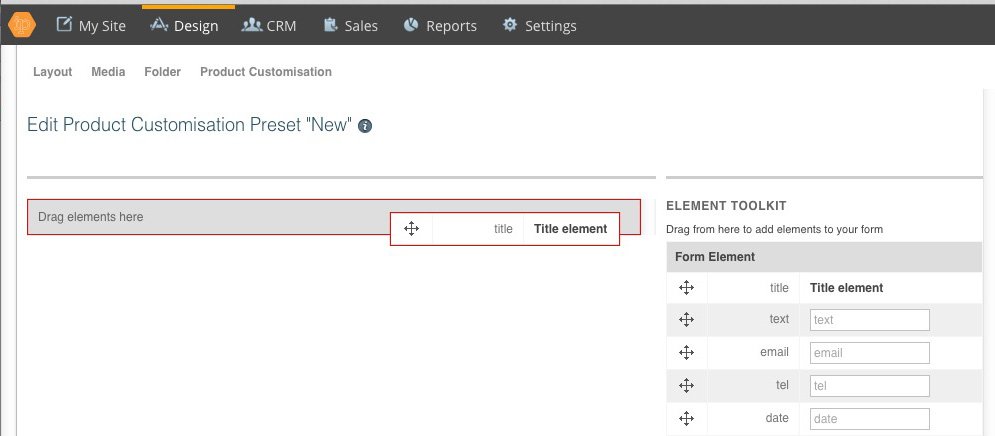
Drag the title element from the toolkit on the right to the area on the left. You will need to drag the element by putting your cursor on the arrows to the left of the title element.
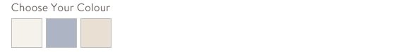
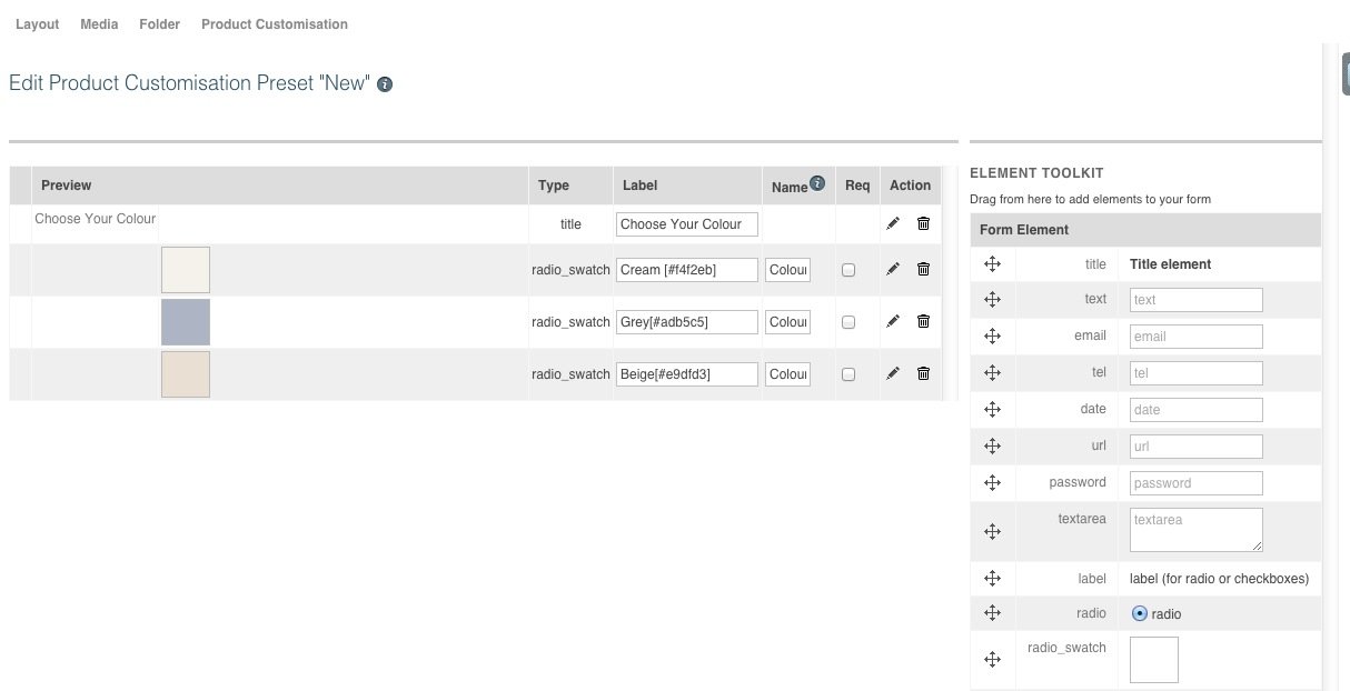
Fill in the label with the title. Here the title is to be for the colour choice swatches so we have filled in the label with 'Choose Your Colour'.
Radio Swatches
Radio swatches are most commonly used for colour choices on a product displayed as coloured tiles. Such as shown here:
Drag a radio swatch element from the toolkit on the right to the area on the left with one element for each colour.
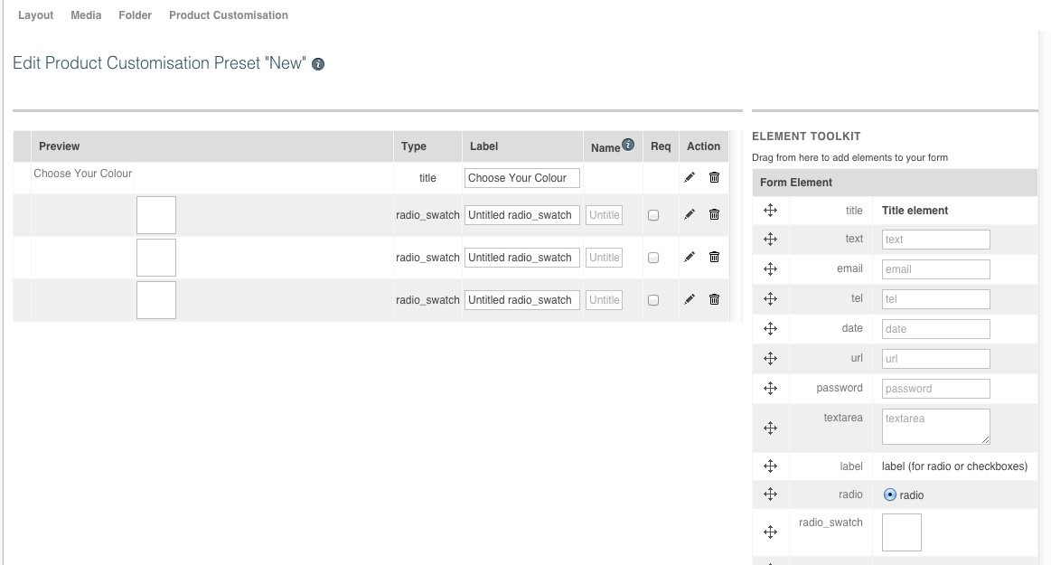
Fill in the name field to be the same for all the colour swatches the customer can choose between in this group. This makes it so that the radio buttons function so that only one colour can be chosen at once.
Fill in the label field with the name you wish to appear when a customer hovers over the colour swatch and the hexadecimal value for the colour you want to show on the swatch. There are various tools you can use to find the hexadecimal number for a colour including Photoshop or this simple online colour picker tool.
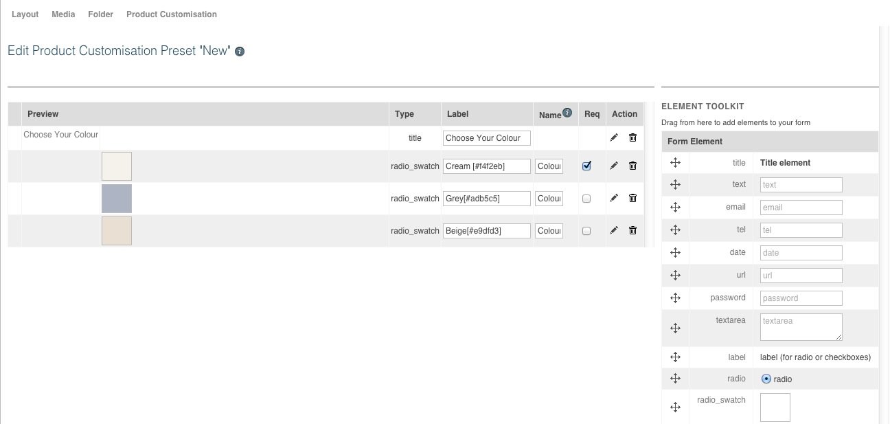
If a customer is required to choose a colour, tick one of the swatches to be a required field. Please note only one of the radio choices needs to be ticked as required.
Select
A select element is used to create drop down boxes
Drag a select element from the toolkit on the right to the area on the left.
Fill in the label with the title. This is what will appear on the drop down box before a customer clicks on it. In the example below, we have put Choose Your Shape.
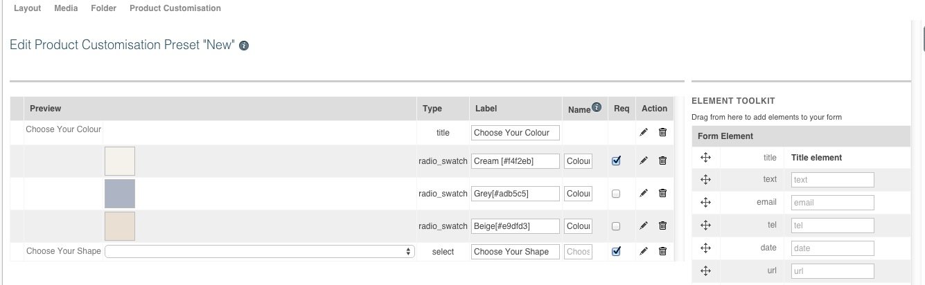
Click the required field box if this is something a customer has to choose in order to buy the product
Click the pencil icon to the right of the required field box and the dialog box below will appear
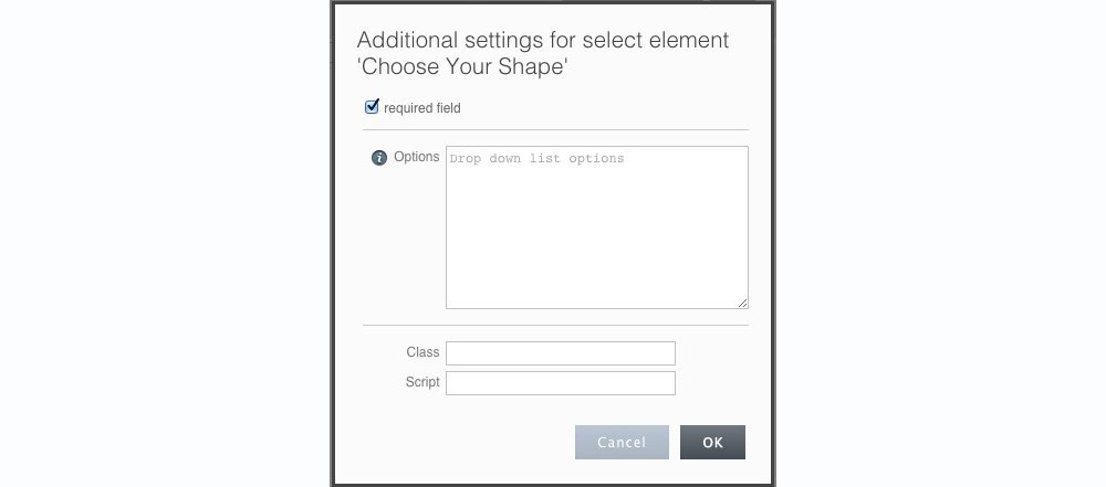
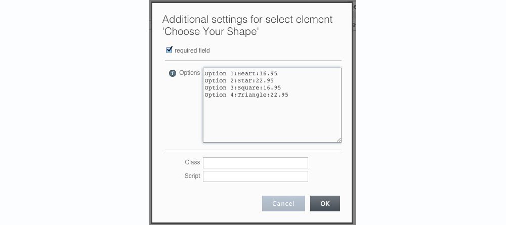
The drop down options are put in by writing them in the box in the following way: "Option x:n:a" where x is the option number which goes in numerical order. n is the option name (this is the wording which will appear on your drop down option) and a is the price if the price of the product changes with this choice chosen and is an optional value. Examples are as follows:
First here are four options of various shapes

Secondly, here are the same four options with pricing changes for each shape. Please note the price change is an optional value and if there is no price change then you can fill in this field just as the example above with no price options
Text Input Fields
A text field is used for a customer to input text.
Drag a text input element from the toolkit on the left
Fill in the Label.
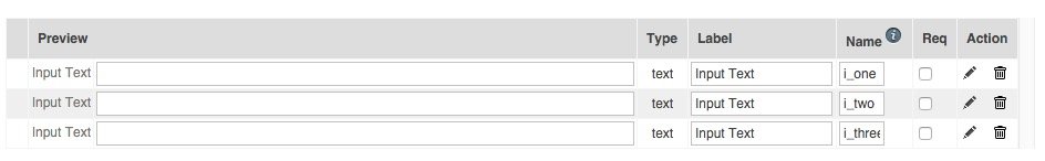
Please note that the Name is automatically populated from the content in the Label and the Name must be unique. This means that if you have more than text input field with the same Label, you will need to manually fill in the Name field in order to make them unique.
Here you can see that there are 3 text input fields all with the label of 'Input Text'. This means they all have the same name of Input_Text as this has been automatically created when you typed in the Label.
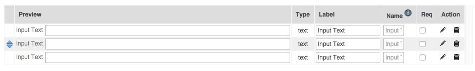
In order that your form works, you will need to manually type in the name. Below you can see manually changed them to i_one, i_two, and i_three. The name should have no spaces and be unique.