Making a Site Responsive
On this page:
- What is Responsive?
- Going Responsive: The Steps
- Activating The Mobile Stylesheet
- Setting Mobile Layout
- Styling The Handburger Menu
- Checking Presets
What is Responsive?
A responsive website is simply one that can be viewed efficiently and aesthetically on other digital platforms such as phones and tablets. Common browser width for computers is between 1000px and 3000px, whereas for tablets it's commonly between 768px and 1024px and for phones it can be as small as 480px.
How to make my single website look good and function well on each platform? Make it responsive!
Going Responsive: The Steps
Caution: We do not recommend changing anything unless you know exactly what you're doing. This part is usually completed by your designer.
Important: If you are working on a live site, we actually recommend you work your way through the steps backwards. This reduces the interuption to the website functionality over the period of going responsive.
Remember to do a check of every page on an actual mobile phone and tablet for working responsivity in addition to these admin stages. In addition to the checks below there may be manually entered CSS which affects the look of the mobile website.
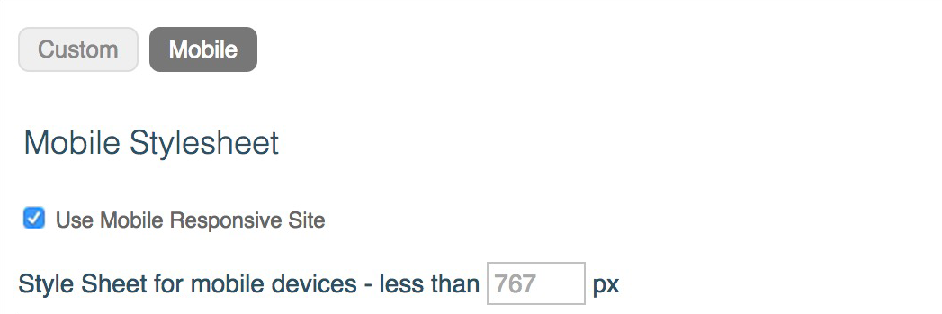
#1 - Activating The Mobile Stylesheet
The first thing you need to do is activate the mobile stylesheet under Design > Stylesheets > Mobile through checking the box marked "Use Mobile Responsive Site".
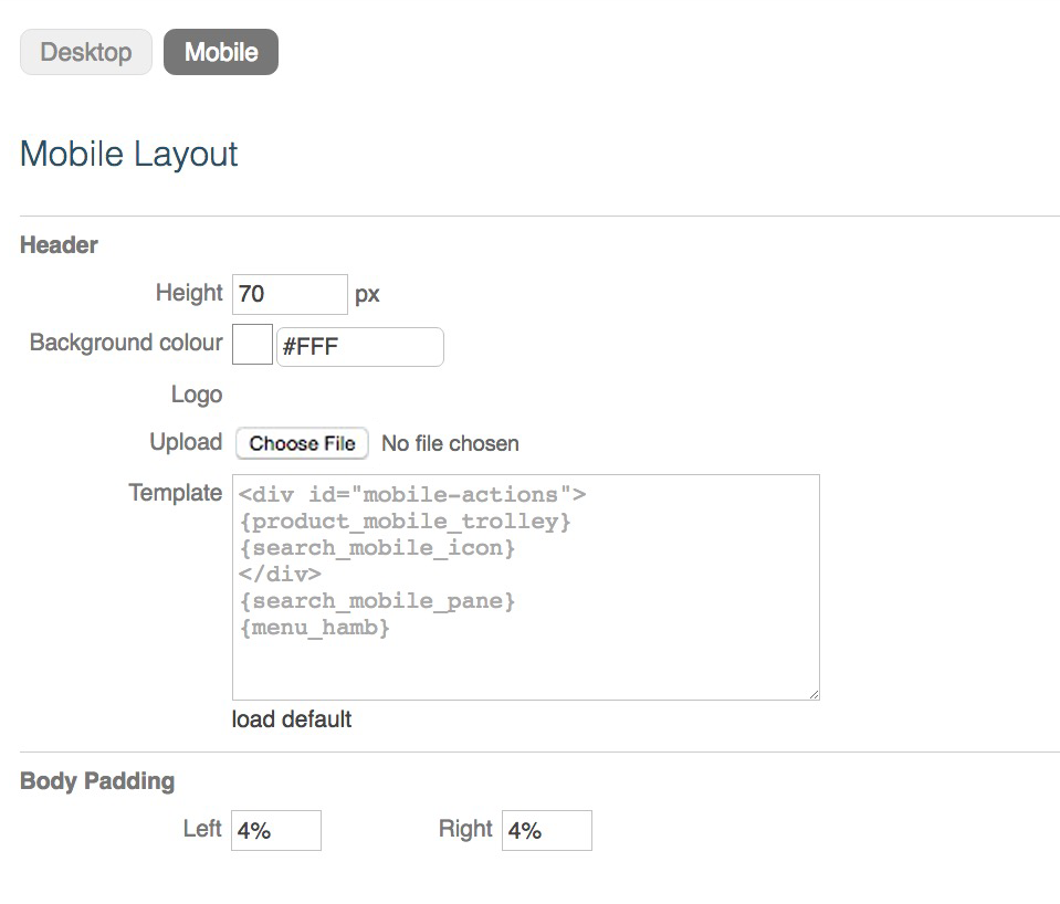
#2 - Setting Mobile Layout
Secondly, your new mobile view needs an adjusted layout. To edit the mobile layout you can find it under Design > Page Layout > Mobile.
Important layout settings for the header are found here including it's height, background color and it's desired logo.
Body padding for a site can also be set here - a recommended amount is 4% left and 4% right.
#3 - Styling The Hamburger Menu
In addition to a new header, your new look needs a new menu. KhooSeller will use your current horizontal menu items, but they need styling under Design > Menus > Hamburger (mobile).
Learn about styling a hamburger menu here.

#4 - Checking Presets
Folder presets and certain media presets have responsive options which will need to be used for them to function with a responsive website.
To check your folder presets, first go to My Site > Presets > Folder.
Make sure each relevant preset in the editor has the box marked "When screen width < page width (mobiles)" ticked beneath "Use Responsive Tiles", with the details of "Mobile Offset" and "Page Down Offset" filled in.
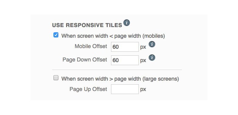
The box below, "When screen width > page width (large screens)", is for making folder tiles responsive for large screens, so that the number of columns of tiles displayed always is at a maximum to the stretched browser width. This doesn't need to be ticked for mobile responsivity.
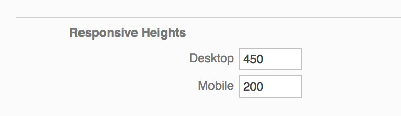
Additionally, media presets which are "Full Width Background Image Galleries" may need adjusting for responsivity. If your website does not use a full width background gallery you can ignore this step.
For the images to function more aesthetically, you may want to set responsive heights. This can be done in the editor beneath "Responsive Heights" by simply setting a number of pixels for desktop and mobile.