

How To Use Built-in Components
On this page:
- Overview
- Bringing in components to the page body
- Bringing in components to page associated content
- Bringing in components to presets
- Correct component form
Overview
Built-in components are substitutions used by KhooSeller to make it easier to bring in complex content into areas of the website.
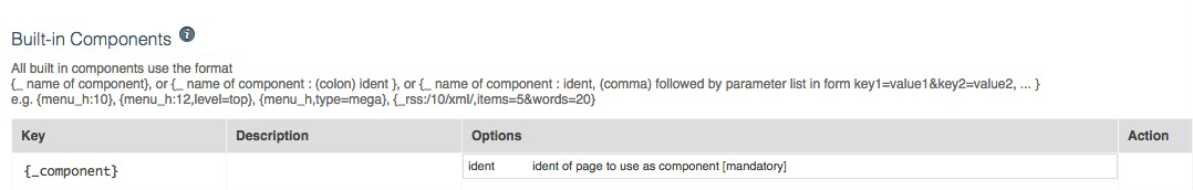
A list of all built-in components can be found within My Site > Components, under the heading Built-in Components.
Information: In this chapter components are displayed with an asterisk "*" at the start for written purposes only. They should not include this when being used.
Within your website, components can be brought into the structure of pages in several ways, including within the page body, within associated content or in module presets.
Bringing in components to the page body
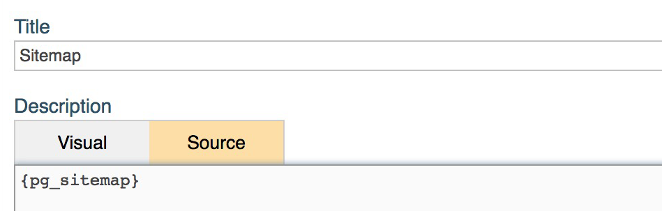
Within the page editor (found by selecting the page under Tree View and clicking "Edit"), components can be brought into the page body through adding them to the content in the "Description" box.
We recommend you add them directly into the "Source" area, outside of HTML text tags, so you can be sure the editor doesn't strip out their meaning. This will likely not be a problem for simple components.
Examples of components you may want to put into page body descriptions include:
- A Contact Form - {*contact_form} or {*crm_contact_form}
- Related Items - {*pg_related}, though this may better be put in the module's layout preset template (see #3 - Presets below)
- A Custom Field - {*pg_custom}
- Folder Items - {*pg_folder}, where the specific folder ident has to be given
- A Sitemap - {*pg_sitemap}
- That Page's Image Gallery - {*pg_gallery_image}
- Map Integration, such as GoogleMaps - {*integration_googlemaps}
- Social Media Integration, such as Instagram or Twitter - {*integration_instagram}, {*integration_tweets}
- Tabbed content, as set within the layout preset - {*pg_tabs}, though this may better be put in the module's layout preset template (see #3 - Presets below)
- Other page body content - {*_component:page ident}
Bringing in components to page associated content
Components can be added into the associated content for a page, so they appear in other layout sections such as in the left and right columns or the content header or footer. Bringing in components to page associated content
To add a component into a different layout section to the page body, first select the page under Tree View and then select "Associated Content".
Within each layout section, components can be added in their respective descriptions, by clicking the "Edit" button next to each section. We recommend you add them directly into the "Source" area, outside of HTML text tags, so you can be sure the editor doesn't strip out their meaning. This will likely not be a problem for simple components.
The benefit of putting components into associated content is that if the components want to be brought into several pages in a folder, the layout sections with components can be inherited from the parent folder. Read more about associated content here. It also makes it easier to divide page content in the page body, e.g. if a component is always desired at the bottom of the page body it can be put in the content footer.
Examples of components you may want to put into page layout sections within page associated content include:
Body header or content header -
- A Breadcrumb Navigation - {*pg_path}
- That Page's Image Gallery - {*pg_gallery_image}
- A Search Bar - {*search_pane}
- Horizontal Menu Navigation - {*menu_h}
- Tabbed content, as set within the layout preset - {*pg_tabs}, though this may better be put in the module's layout preset template (see #3 - Presets below)
Left and right columns -
- A News Feed - {*_rss:/ident,parameter list}
- Vertical Menu Navigation - {*menu_v}
- Tabbed content, as set within the layout preset - {*pg_tabs}, though this may better be put in the module's layout preset template (see #3 - Presets below)
- Social Media Integration, such as Instagram or Twitter - {*integration_instagram}, {*integration_tweets}
- A Custom Field - {*pg_custom}
Content footer -
- A News Feed - {*_rss:/ident,parameter list}
- Social Media Integration, such as Instagram or Twitter - {*integration_instagram}, {*integration_tweets}
- Page Related Items - {*pg_related}, though this may better be put in the module's layout preset template (see #3 - Presets below)
- A Contact Form - {*contact_form}
Bringing in components to presets
Presets used in your website can be found within KhooSeller under My Site > Presets. You can read more about what presets are here.
Within a layout preset (under My Site > Presets > Layout), or folder preset (under My Site > Presets > Folder), components can be added to the "Template" section.
The components will be arranged on the page following the order in this section. HTML can also be entered here to further structure the page into div block sections.
Be reminded that the layout preset defines the overall appearance of a specific module, whereas the folder preset defines how the component of folder items {*pg_folder} are displayed. Read more about layout presets and folder presets here.
Examples of components you may want to put into presets include:
Layout presets -
- Page Related Items - {*pg_related}
- Folder Items - {*pg_folder}
- A News Feed - {*_rss:/ident,parameter list}
- That Page's Gallery Images - {*pg_gallery_image}
- Tabbed content, as set within the layout preset - {*pg_tabs}
- The Content of another Page Body - {*_component:page ident}
Folder presets -
- The Page Body as part of the Folder Item Listing - e.g. {*pg_body}, {*pg_body_smart:80}
Correct Component Form
Different formatting options for components are available depending on the type of content it is bringing in, which can be seen in the right column under "Built-in Components".
For example, options available for the basic menu components, {*menu_h}, {*menu_v}, include the folder to build the menu from (the ident) and the amount of downward levels the menu is to have (used from the levels shown in Tree View). Contrastingly, for the twitter integration component, {*integration_tweets} options include the number of tweets shown and whether interactive icons and images are shown.
When bringing in a component, it's formatting options need to be addressed for the component to function as desired. The standard format for inputting components follows one of the forms shown below, either:
- {*name of component} - e.g. {*pg_related} (where no formatting option is needed)
- {*name of component:ident} - e.g. {*menu_h:10}
- {*name of component:ident,parameter list} - e.g. {*menu_h:level=top} or {*menu_h,type=mega} or {*_rss:/10/xml/,items=5&words=20}
No spaces are used in components. The parameter list (this gives the component its characteristics) follows the form: { ... key1=value1&key2=value2 ... }.
KhooSeller recommend you do not surround components in text HTML tags as this can strip out their meaning. We recommend you put into div HTML blocks so they can be visually arranged. Read more about how you can bring in components below.
Other types of built-in components that are available can be found at the bottom of the My Site > Components page under "Other Page Substitutions Available".