

Understanding the Form Builder
Form Builder: A tool in the Admin Area of KhooSeller that lets you build a custom Contact Form with a variety of elements.
On this page:
Using the Form Builder
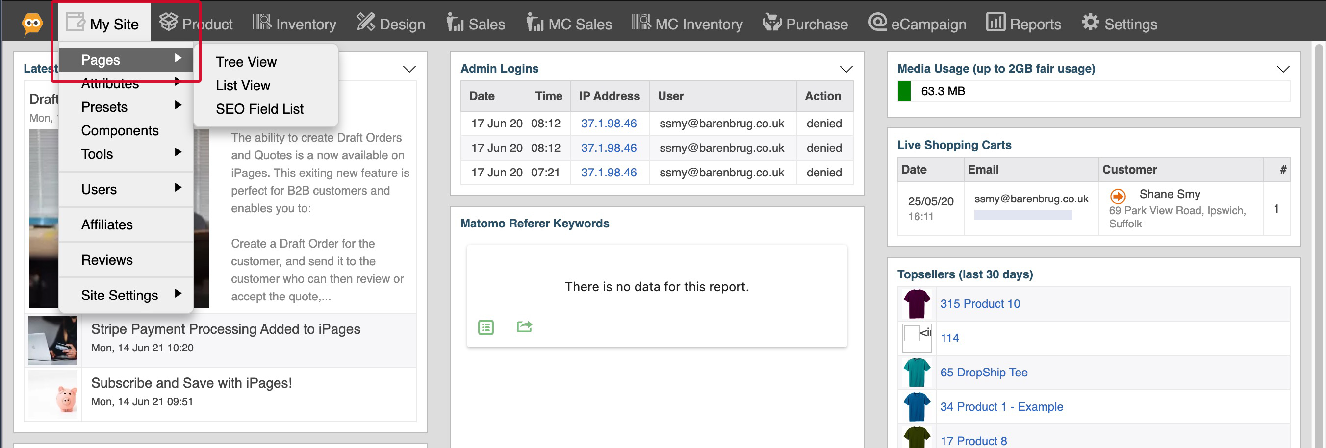
1. To use the Form Builder on a contact form in the Admin Area of your KhooSeller website, first, go to My Site > Pages.
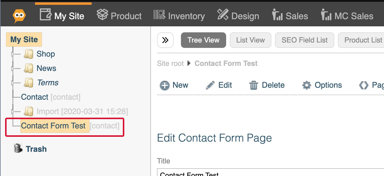
2. Click on the contact form in the list view.
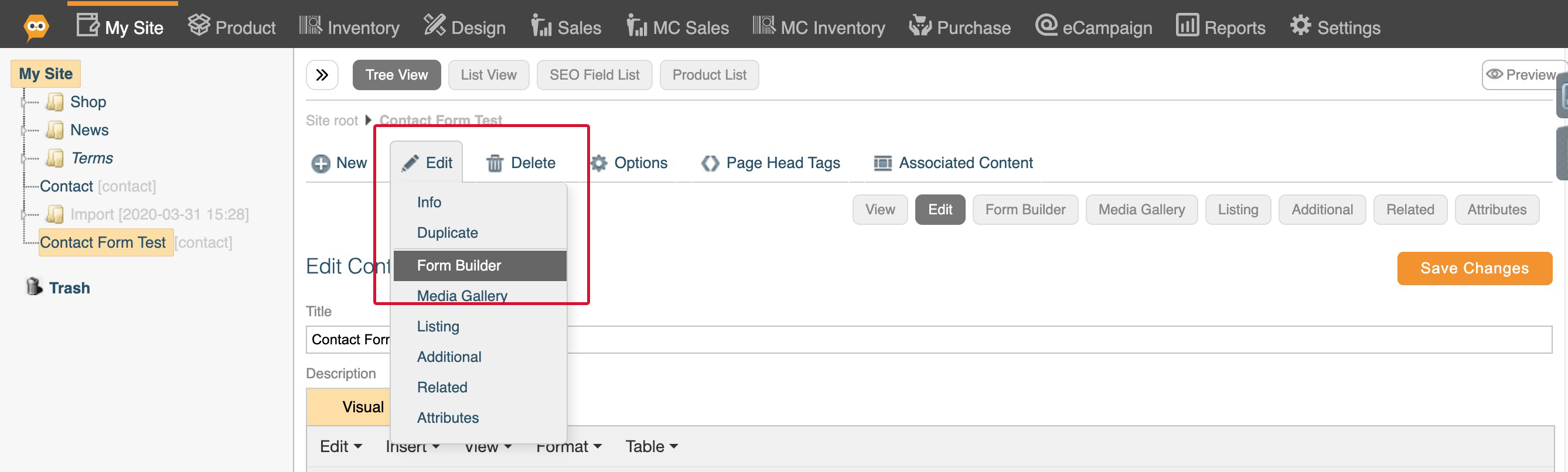
3. Hover over Edit and then click Form Builder.
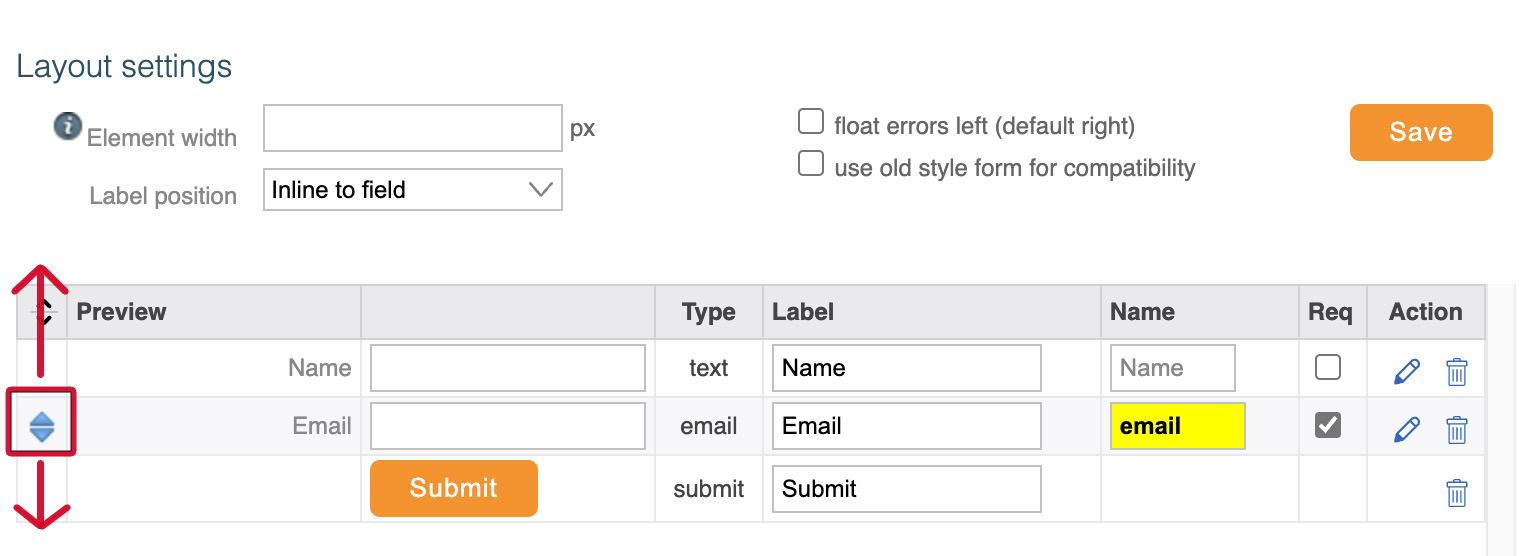
4. Fill out the Layout Settings.
The Layout Settings of the Form Builder Consists of four fields:
Element Width - Sets the width of the contact form elements in pixels. You can leave this field blank for the width to be 100%.
Label Position - Label position is a drop-down menu that sets how the labels will be positioned in the contact form. You can choose the labels to be inline to the field, Inside the field or above the field.
Float Errors Left - Clicking this checkbox floats any errors from filling out the form incorrectly to the left of the contact form. Leaving it blank floats the errors to the right.
Use Old Style Form - Please leave this checkbox empty as all Church Pages websites will never have to use old-style forms. Old-style forms are used for websites that haven't got a responsive design.
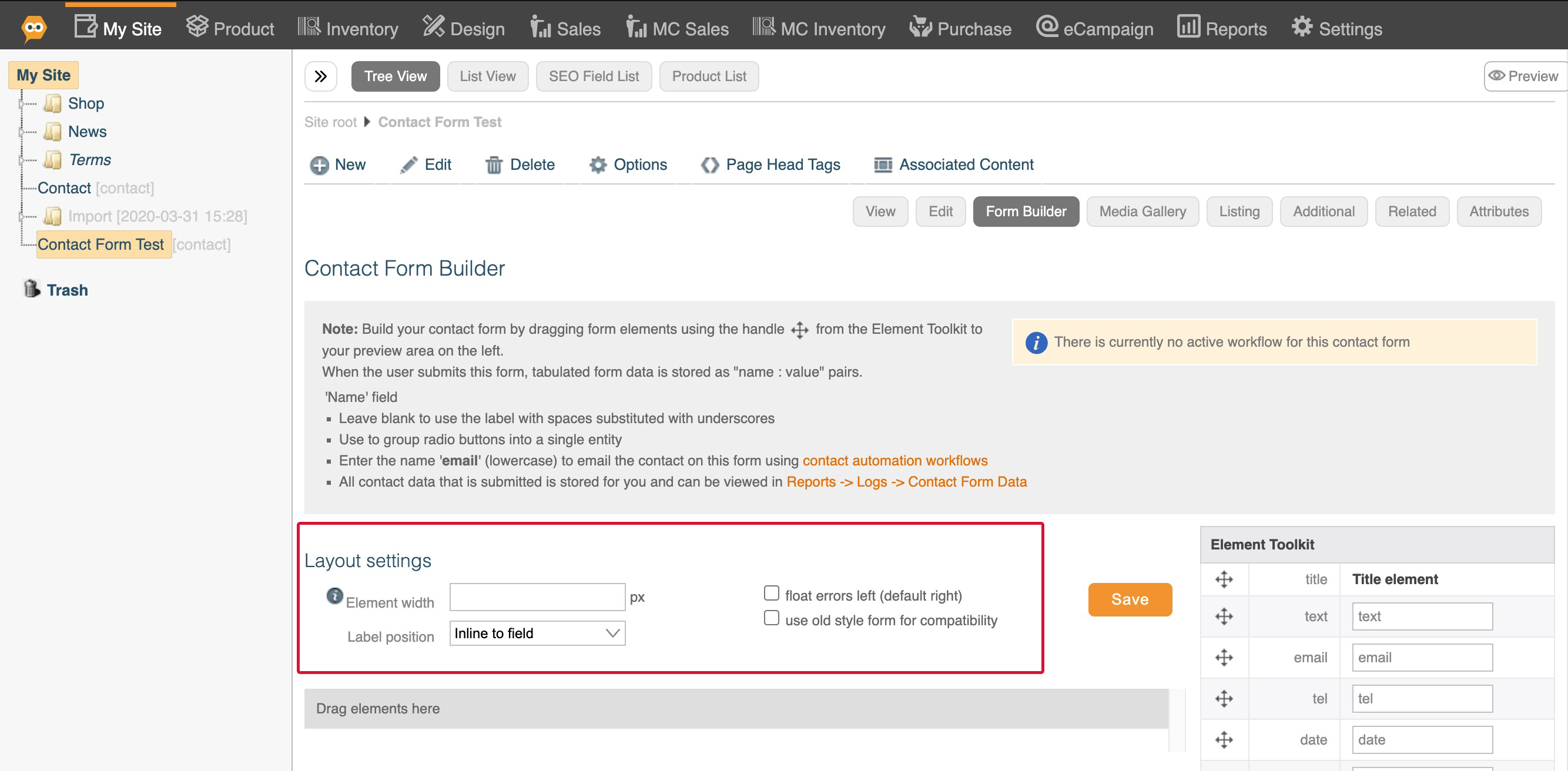
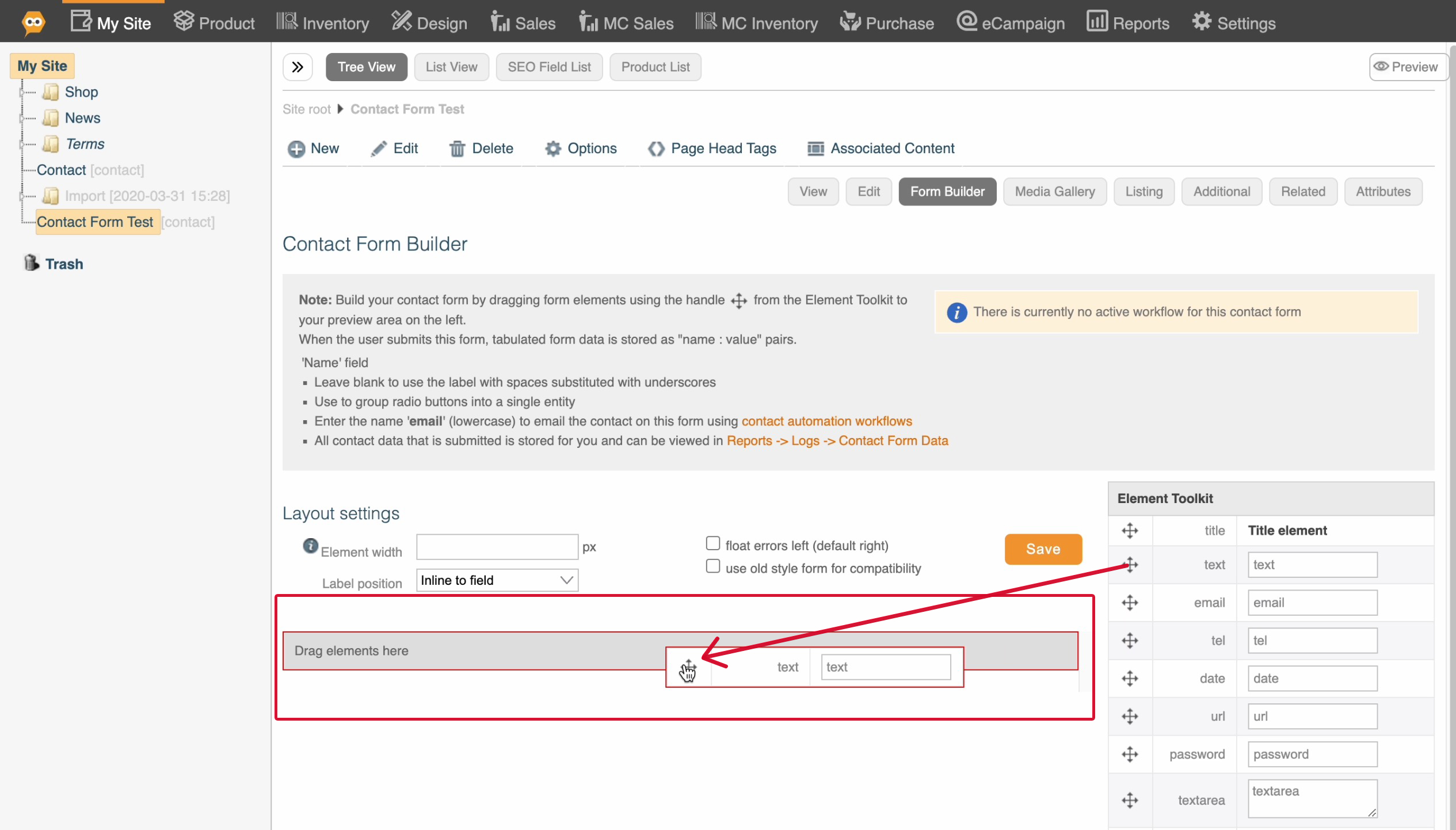
5. Drag and drop the required elements from the Element Toolkit into the Drag elements here table. For more information on the Element Toolkit, click here.
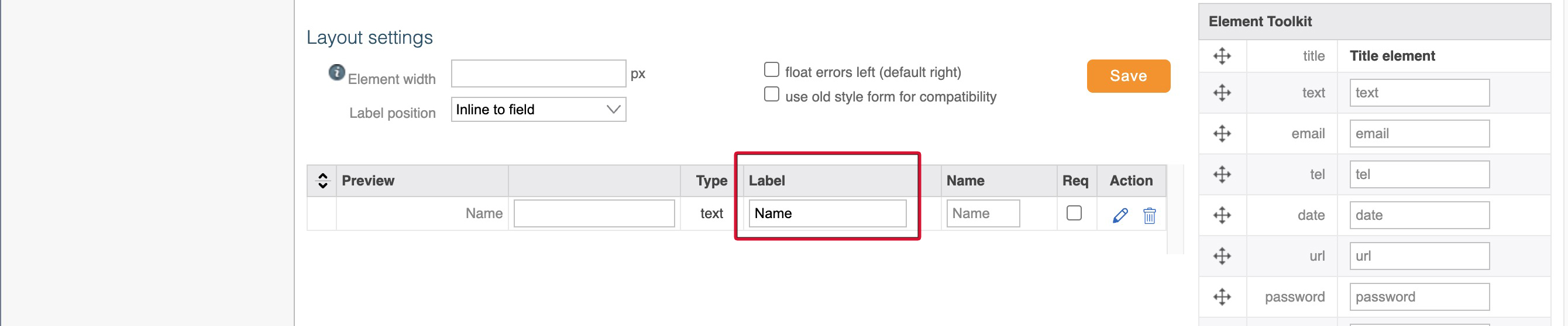
6. Add a Label to the element using the text box under the Label heading.
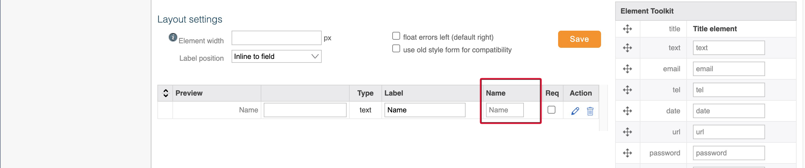
7. Add a Name to the element by typing into the text box under the Name heading.
Leaving the name field blank automatically sets it to the same as the label but with spaces substituted with underscores.
You can group multiple radio button elements together by using the same name.
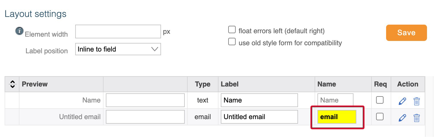
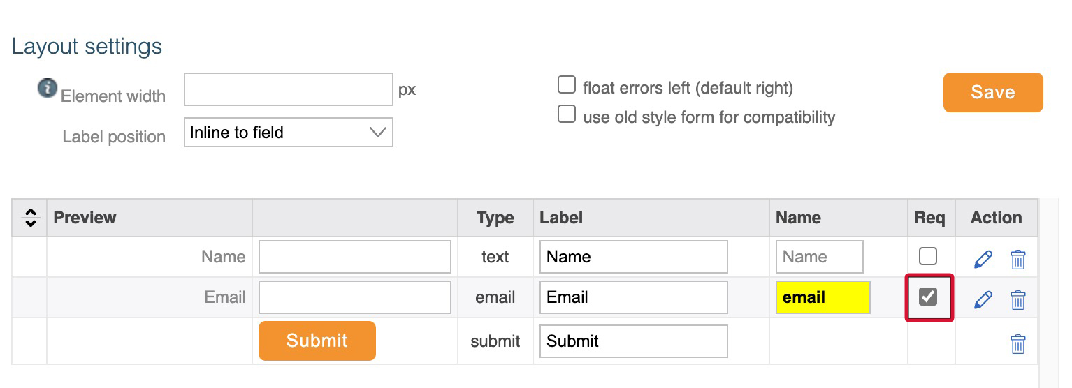
8. You must use an email element in your form so that the automated workflow can send an email to the person who has submitted the form. This element must have a name of ' email ' where email is all in lowercase. The name will turn yellow when it is correct.
9. If the element is a required field, click the checkbox under the Req heading.
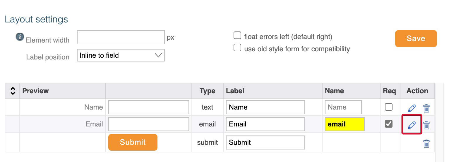
10. Set additional settings for elements by clicking the pencil icon.
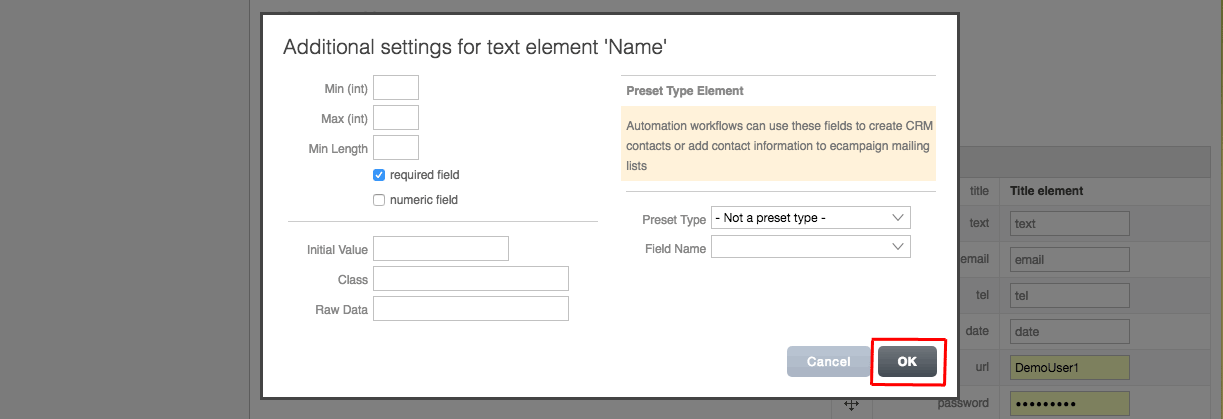
11. After you've set up your additional settings, Click OK.
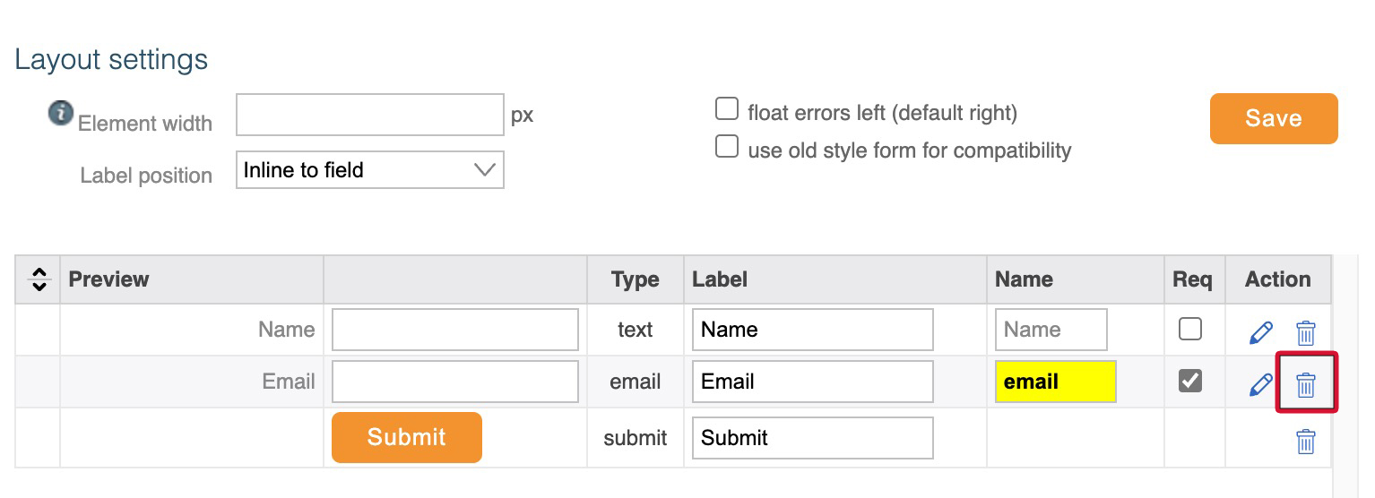
12. You can delete elements by clicking the trash icon.
13. You can change the order of elements by clicking the blue arrows icon under the drag handle heading and then dragging the element up or down.
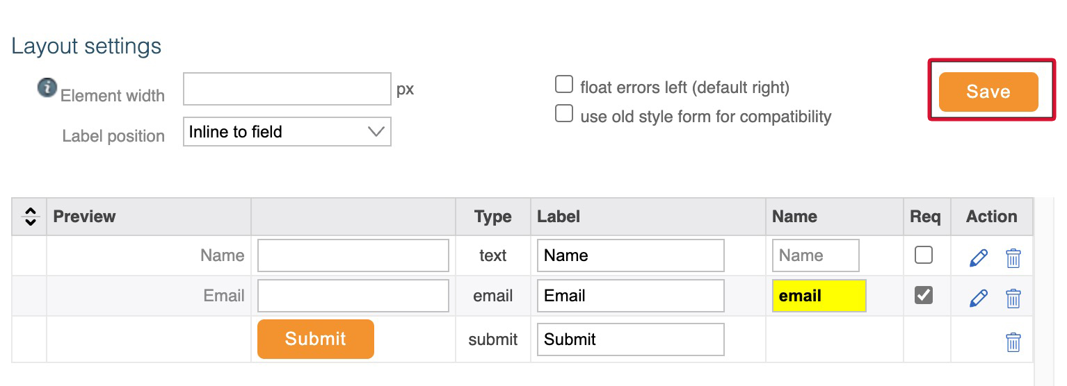
14. Once you have all of your elements correctly added to your form, check you have both an 'email' element and a 'submit' element so your site visitor can submit your form. Then Click Save.
15. Once your form is built, next you must add an automated workflow so that both you and the person who submitted the form are notified when someone submits the form.
Element Toolkit
The Element Toolkit is a table of Contact Form elements that each have a unique function.
Title - Used to add a title to your contact form.
Text - Used to add text elements to your contact form.
Email - Used to add an email element to your contact form. You must type "email" (in lowercase!) into the name field for them to be compatible with your Automated Workflows.
Tel - Used to add a telephone number element to your contact form
Date - Adds a date element to your contact form. Displayed as DD/MM/YYYY.
URL - Adds a URL element to your contact form. This lets users submit links.
Password - Adds a password element to your contact form. It blocks out the password from the preview when submitted.
Textarea - Used to add a text area to your contact form. Textarea's are similar to the Text element but has more space for users to submit a longer string of text.
Label - Adds a label to your contact form. Labels can be used for groups of Radio and Checkbox elements.
Radio - Adds a radio element to your contact form. Radio elements operate as a group when they have the same name field. They provide mutually exclusive selection values. Users will not be able to select more than one radio element in the same group.
Checkbox - Adds a checkbox element to your contact form. Checkboxes operate as a group when they have the same name field. Within a checkbox group, checkboxes operate individually but allow the user to select more than one option in the same group.
Select - Used to add a select element to your contact form. Select elements let you create a drop-down list of options that users can select when filling out your contact form. The options are added by clicking the pencil icon under the Action heading in the Form Builder and then filling out the Options text box.
File - Used to add a file element to your contact form. The file element lets users upload and submit a file with the contact form.
Captcha - Adds a captcha element to your contact form. Captcha's make sure that it's a human filling out the contact form by having them key in letters displayed in a box that the computer is unable to read, but will be readable for people.
Address - Adds an address lookup element to your contact form. The address lookup helps users to find their address by displaying all address options from a postcode, house name, or another part of the address that the user enters. This lets users fill out their address in the correct format without the need to type out the whole thing.
Hidden - Adds a hidden element to your contact form. Hidden elements are not visible to the user filling out the contact form.
Submit - Adds a Submit element to your contact form. The submit element adds a button that when a user has finished filling out the contact form and then clicks on, sends the completed contact form to you.
HTML - Used to add a Raw HTML element to your contact form. This element lets you add raw HTML to your form. This can be useful for adding the foundation grid and changing how the form looks. We recommend that you don't use this element without a good understanding of HTML.
Preset Mail List - Adds the eCampaign Mailing List Member element to your contact form. This element adds a preset of elements already set up and working to your contact form. Using this preset will create a form that adds the users who submit the form to a mailing list.
Preset CRM Contact - Adds the CRM Contact Member element to your contact form. This element adds a preset of elements already set up and working to your contact form. Using this preset will create a form that adds the users who submit the form to a CRM contact list.