Designer FAQs
How do you style Bullet points? e.g. I’d like the bullets to be round and in the cyan blue colour #31acde
Styling bullet points in KhooSeller is no different to styling bullet points in any html document. You simply go to Design > Style Sheets and put the css in custom css area. The div class of pg-body wraps all content put in the edit content area so it can be an idea to prefix your styling with .pg-body in order to ensure specifity.
Occasionally, I have seen people use the • character in the html. They wrap it in a span and give it a class and use css to colour the bullet to the desired colour. This method can result in bloated html though if there are a lot of lists through the site.
How do we reduce the line spacing above and below the H1 headings?
Again this is done in the usual way with css. In KhooSeller all elements which you may need to target generally already have a class attached so it is possible to inspect these within the browser to find the class.
It is important to make sure that your css ensures that when you hand the site over to your client that when they choose an h1, all the spacing will always be consistent with any new pages they put in. The following options are the main ones
Prefixing the h1 with .template will target all h1s within the entire front end of the website and this should be put in the custom css found at Design > Style Sheets.
Prefixing the h1 with .template h1.pg-title will target all the h1s which are input with the title field in the edit page area. Other classes which are attached to various elements can be found through inspecting the elements with your preferred browser. For instance all the titles of products in a folder tile view can be targetted with .folder-product.folder-tile h3.pg-title-list. You will find everything within KhooSeller is possible to target with the css making the system very flexible and no need to learn any system specific code
It is sometimes preferable to put the css directly in the css area of the layout preset rather than in the global custom css area. The layout presets are found at Design > Presets > Layout > Your Preset or Design > Presets > Folder > Your Preset. This means that that css will only apply to pages and folders which have that layout preset selected to use. This gives you the flexibility and control of keeping certain types of pages consistent with each other while enabling the client to have control over their website without accidentally breaking consistency with styling.
How do we reduce the line spacing below the H2 headings?
Please see previous answer
Is there an easy way to add horizontal lines when adding content?
This again is done the same way as in any website built with html and css. There is an hr element which you can put in the html. It used to be difficult to design these consistently cross browser and so many would use an empty div with a class of say "content-divider". The important thing to remember if using the div method is to put a no breaking space character within the div or the wysiwyg editor does sometimes strip out empty divs. Here's a handy link to some css tricks with hr elements.
How do you add the Title/header bar in the Vertical Navigation Menu in the right hand column?
There are two ways of doing this. You can either put in the html at the top of the right hand column in the default associated content or my preferred way is to put titles in with the :before pseudo class in the css.
How does the Associated Content work?
Each page is made up of the main content area which is the area most commonly edited by the client. Each page then has content which is associated to that page which is the header, navigation, left column, right column and footer. We've also added in a body header, content header, content footer and body footer. These areas make it possible to have the same content appearing through multiple pages and areas. At the root level is the default associated content and the header and footer content is usually set here. The body footer is often set here too and often contains social media links. This content cascades through the whole site unless over-ridden on an individual folder or page. The associated content for any page will always inherit from its parent folder. This gives complete control over every page throughout your website.
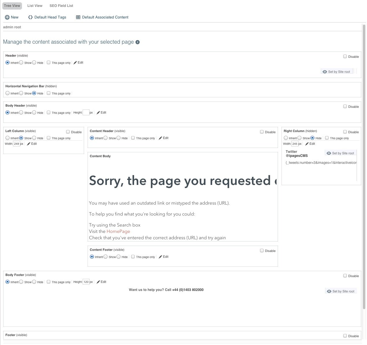
The visibility of associated content is set here too so you can show or hide any content associated with any page and it also inherits from its parent folder unless 'this page only' is clicked also. This most commonly controls the navigation showing on folders of products and hiding on the product page itself. To do this, the left hand column's width is set at root level and set to hide. Then on folders where you want the navigation to show, you simply click 'show' and 'this page only' on the left hand column. Each individual product will continue to inherit from the root level since 'this page only' stops the pages below inheriting its value. If 'this page only' wasn't ticked then each individual product page below the folder would also show the left hand column.
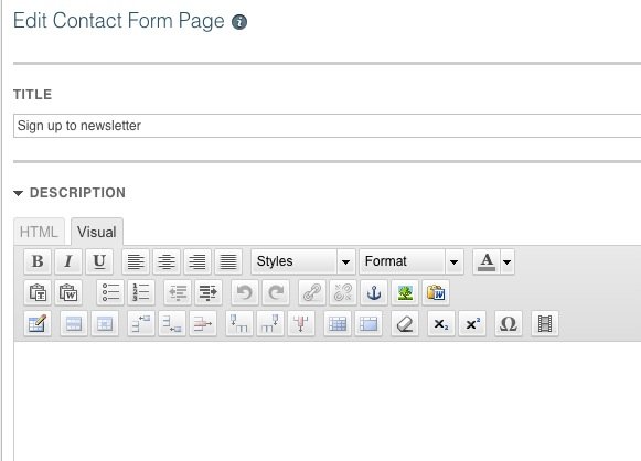
Can I add a paragraph of text above the Contact Form?
Yes. If you click on 'Description' in the edit contact form area, the usual wysiwyg editor will appear for you to input content.
Can we set the YouTube videos to play directly on the Home page, rather than going away from the site to YouTube?
You can embed YouTube videos to play in any page simply using the embed codes provided by YouTube. If embedding into a responsive website, extra code is needed since YouTube don't yet provide responsive embed code. Simply wrap the embed code provided by YouTube in a div with a class of video-container and then include the code below in your style sheet here: Design > Style Sheets
/* -----------------------------------------------------------------------------------
CODE FOR RESPONSIVE EMBEDDED YOUTUBE VIDEOS
--------------------------------------------------------------------------------------*/
.video-container { position:relative; padding-bottom: 56.25%; padding-top: 30px; height: 0; overflow: hidden }
.video-container iframe, .video-container object, .video-container embed { position:absolute; top:0; left:0; width:100%; height:100% }
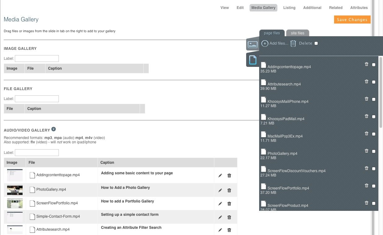
Is there a built-in media player within KhooSeller?
There is although we usually recommend clients to stream from YouTube or Vimeo to make best use of the extra SEO benefits provided by doing it this way. YouTube is the second largest search engine after Google and is bigger than Bing, Yahoo!, Ask and AOL combined. However, occasionally clients have content which is going behind an access controlled area and so need to stream it directly from the KhooSeller servers.
It's simply done by:
- Setting up a media preset for the video gallery: Design > Presets > Media.
- Setting up a layout preset set to use the video gallery preset: Design > Presets > Layout.
- Uploading your video in the files tab on the page
- Dragging your video from the files upload area into the media gallery for the page
Is it possible to add the vertical menu (currently in the right hand column) at the bottom of each page on mobile devices?
It shouldn't be necessary to do this since the vertical menu in the right hand column automatically gets included in the hamburger menu which appears on mobile devices so all pages are possible to navigate to using this.
However, it is possible in addition to this to add the vertical menu at the bottom just for mobile devices, you can use the vertical menu component where the number 123 here is replaced by the ident of the folder you wish the navigation to be built from. The ident is always unique and can be seen in the url for each page and folder within KhooSeller. The ident for this page is 262 for example.

You would then put this component in a div set to show on mobile devices only. This can be done simply in KhooSeller by adding a class to the div such as 'show-for-mobile'. The 'show-for-mobile' class is put in the main custom css in Design > Style Sheets and set to display: none. It's then put in the mobile style sheet which is in Design > Style Sheets > mobile and set to display: block. Any further styling specific for mobile devices can be put here too. It would be advisable to put this component in the content footer for the folder so that you only need to put the component in once and allow it to cascade through the other pages within the folder which will inherit the content from their parent folder.
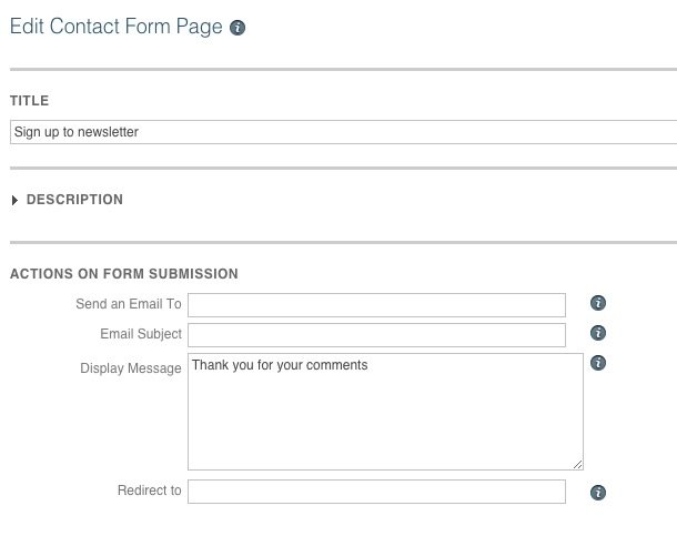
How do I change the response text after submitting the Newsletter Signup form? Eg. After submitting the Newsletter signup, the response text reads “Thank you for your comments”. We would like it to just read “Thank you”
Simply go to My Site > Pages. Then click on your contact form in the left hand column and click 'edit'. This will bring up a field called 'Display Message' where you can edit your response text.